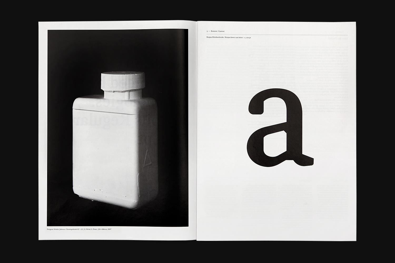
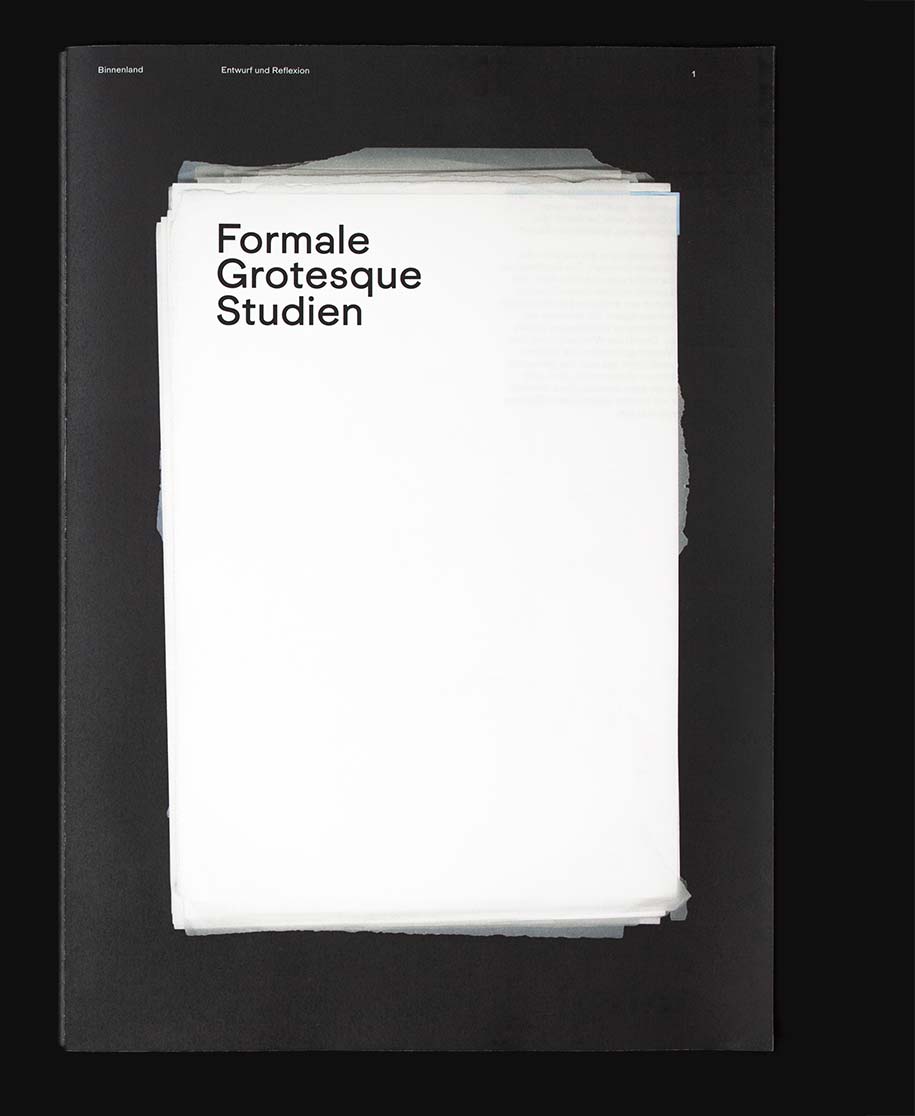
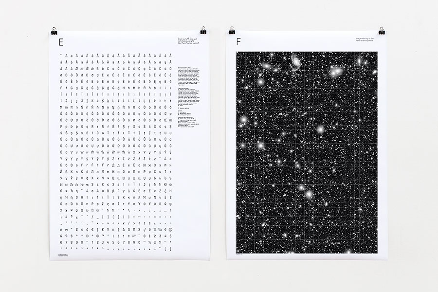
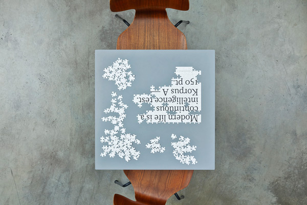
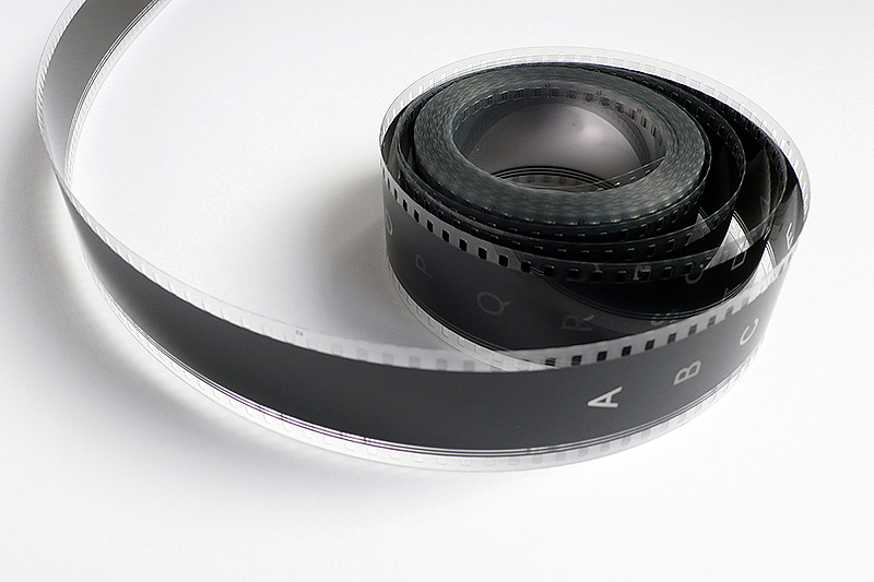
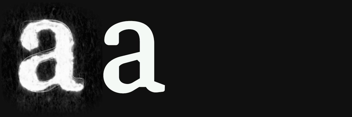
With this 24-page journal Binnenland is opening a discourse about its typeface development. This first study offers a starting-point for a planned and continuing examination of type, text and image. We would like to use relationships that are not immediately obvious, but conjectured, in order to draw new interpretative forms together and to create a broad research field around our typeface development. These debates are to be complemented by interdisciplinary contributions and will deliberately not restrict themselves to exclusively design-related views.
The title of this first issue ‘The result is constantly influenced by the technologies’ relates to technical interfaces. This applies to the photographic work ‘Res’ that we invited Pascal Petignat and Martin Scholz-Jakszus to create, and also to the Korpus font developed in 2009.
Neither of these two works is addressing finds from the past that are visibly smudged on the surface; they are redefining and capturing a state of affairs created by all the typically individual qualities of a tool. It is about shifting materials into new qualities and onto new scales. Mistakes are visible within this process, simply because the technologies used are so precisly. The breaks and blisters in the casts of the liquid containers illustrated by Petignat and Scholz-Jakszus are evidence of transfer which corresponds with the dot and black gain in letterpress printing. Karin Frei Rappenecker puts in a plea for mistakes as a creative source.
