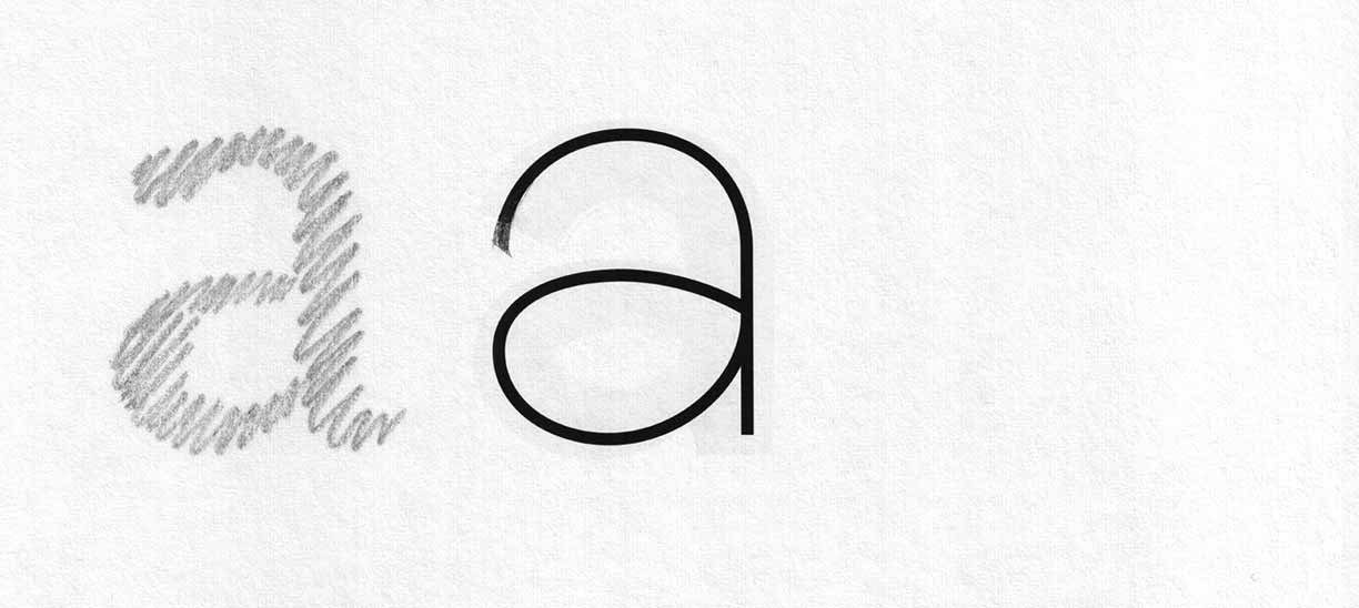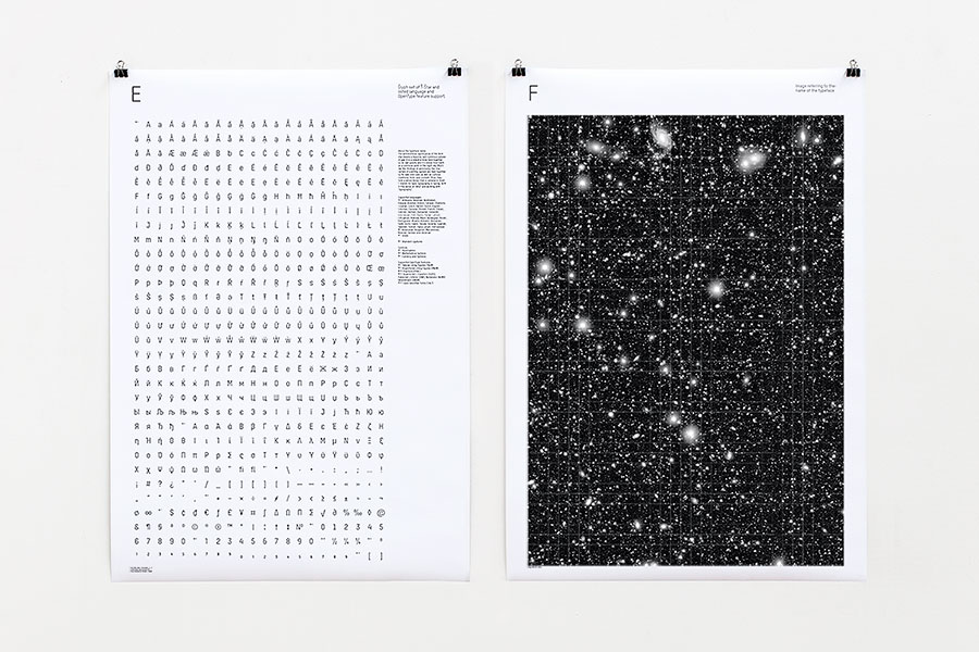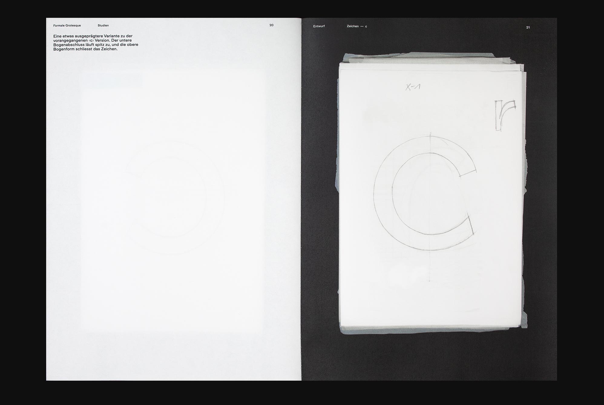
As we were developing the Formale Grotesque typeface, we began to wonder how we might be able to expand our creative repertoire and our design vocabulary. This large format publication, produced on a photocopier, brings together the development of the Formale Grotesque in a selection of design studies. It is a formal and graphically debat accompanied by our thoughts and decisions that arose during the development of the typeface. These studies were the result of a dialogue on how typefaces were designed before the age of the computer, shaped as contour drawings and unwanted deviations corrected by tracing the characters again using chalk paper. In this way, we gradually approached the final forms in a kind of layering. By repeating the drawing process, the shapes were modelled and condensed until the desired shape of the letters emerged. Only at a very late stage we integrated a cross-media working method in which we used already digitised characters as a template again. Accompanied by a conversation On Sketching Glyphs with type designer Stefan Willerstorfer, we discussed the process of creating fonts and drawing characters.