Explore

On Sketching Glyphs

Interview with Stefan Willerstorfer / 2025-07-03


Grey — Blur — Aura
As we were developing the Formale Grotesque typeface, we began to wonder how we might be able to expand our creative repertoire and our design vocabulary. We thought about the aura of blur and those aspects of arriving at a design by analogue means of draughtsmanship entailed therein. We met type designer Stefan Willerstorfer to exchange our thoughts. His contribution about analogue sketching in the typeface design process to «Yearbook of Type # 4» (Slanted, 2019) describes the significance of the greyscale value. He writes about what is decisive to him in the process of sketching, of drawing in analogue form.

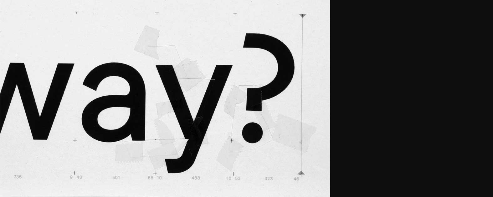
There is much talk about the significance of draughtsmanship, about sketching in the process of discovering a shape for a letter. Stefan Willerstorfer explicitly describes it in this particular phase as a greyscale value: the process of finding a more open definition of the distinctive boundary between black and white via the grey of a drawing and thereby finding a way of communicating the intention coherently yet still leaving open the potential of multiple interpretations. The decisions that must be taken can still be situated in the space that is made available by grey. We are not quite so discriminatory at this point: our focus is on the process rather than its goal. In this context, grey can also be described as blur, or aura. In the process of sketching, grey is a mediator for where the boundary will eventually be, where it will run between black and white, but without yet having to pin it down.


Stefan:    When I start, I don’t go to the computer straight away – instead, I start with a sketch on paper. That strikes me as even more important when I work with letters than for other designs. I stick to the medium. Writing started on paper, and that is what I am designing the typeface for. Of course it could be argued that I am also designing for a digital medium, and hence I could only work digitally. But I feel closer to the hand-drawn sketch. For the upright glyphs, I start with a hatching technique in order to define the space of the character – approximately how much room it can take up. The outline will not be added until later. For italic glyphs, on the other hand, I like starting with the pen, the broad nib pen or the pointed pen, depending on which tool the typeface is supposed to be inspired by. In other words, I start by writing, and then I use transparent paper to go over it, interpret and give more focus to the designs. This is how I gain some distance to writing again and return to design to locate the form I want along this path.


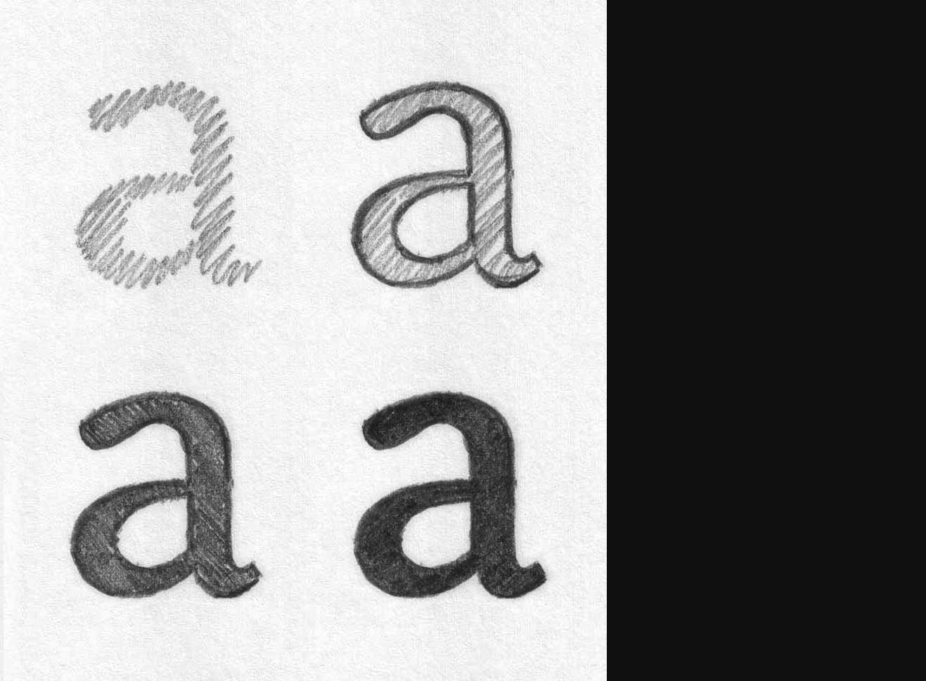
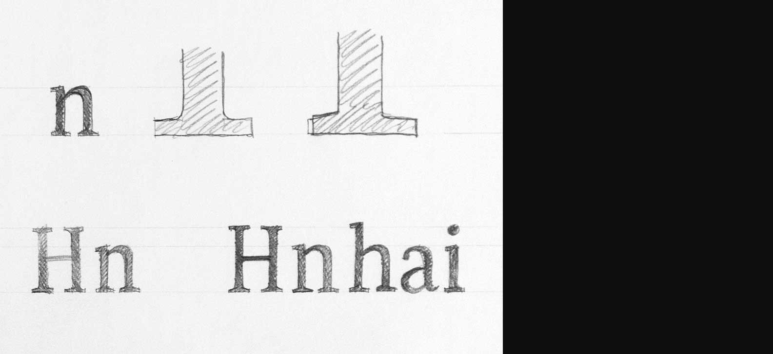
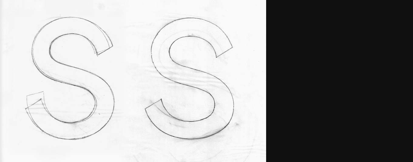
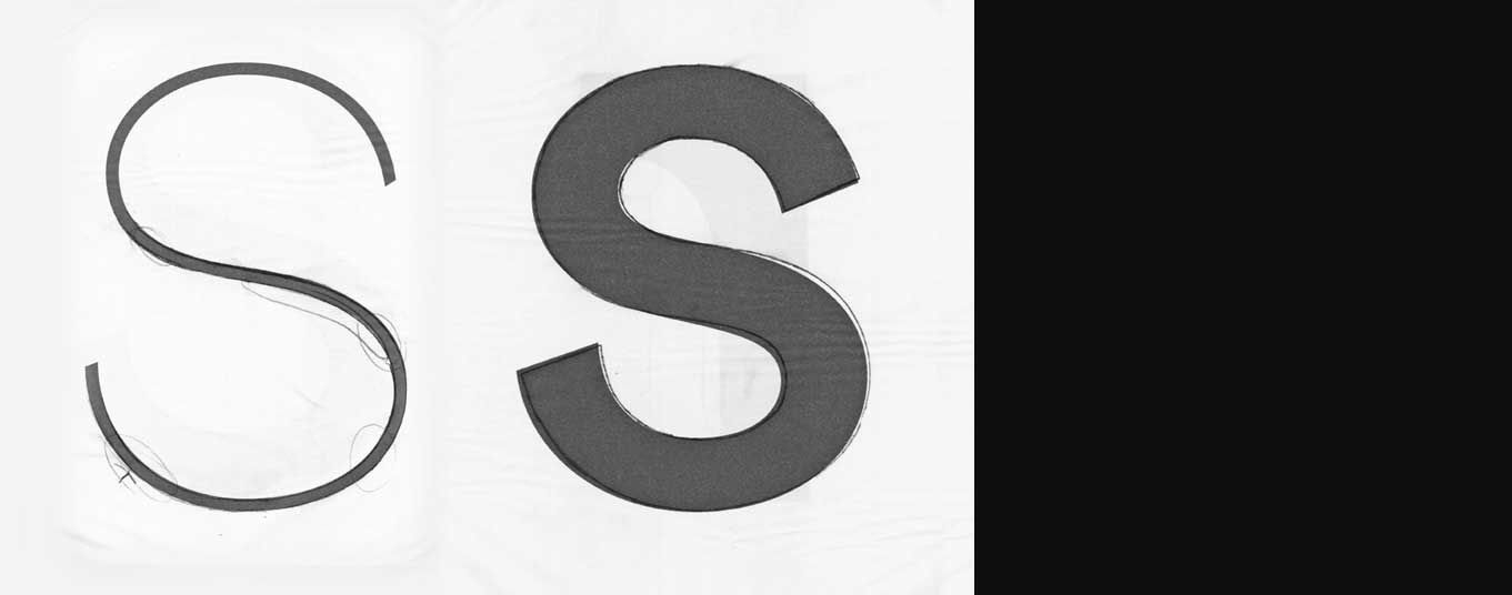
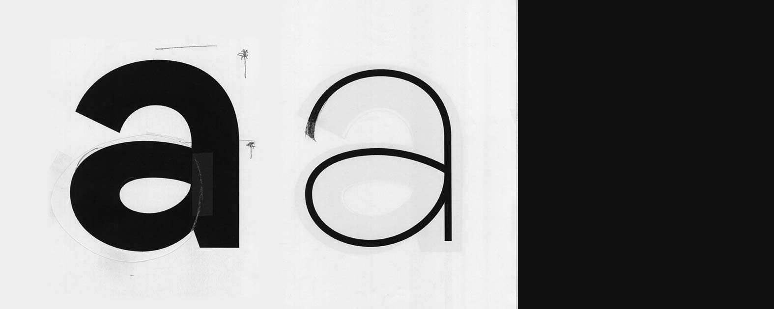
Hatching is still devoid of a defined boundary. The glyph still takes an auratic form, yet it is already imbued with proportions and reach within the associated ideas. The hatched form provides the basic structure, and it is within that articulation that the glyph will settle. We take a look at that process for the typeface Sindelar (Stefan Willerstorfer, 2014) at hand of four ‹a›s next to each other: the hatched one simulating the broad nib pen, the one equipped with an outline, and two others with additional hatching on top to gradually darken the gray value. This series illustrates his chosen method of working. The other sketches that are provided originate from the design process and yet they demonstrate how astonishingly close the sketch already comes to the finished Sindelar.

fig

Hatching, completed with the outline and with another hatching over it, the approach of Stefan Willerstorfer to the sign. 

Stefan:    I like how much there was there already even at this point, and at the same time how many decision were still possible in the later stages of the process – decisions I was not forced to take at that moment in time. With every step, I can take further decisions and still maintain a certain degree of freedom. I don’t have to think about what is supposed to happen in step two or step three. If I started with the outline, I would have to answer a lot of questions right from the outset – but I don’t have the answers yet at that point. Having to do so would limit me and make too many demands on the quality. It means that there are also things that I cannot yet see entirely clearly. However, they are already there within the design: aspects that only emerge with hindsight, in the course of the process, like the nature of the teardrop, how the terminal works. By using this applied principle of hatching, I can include a different quality from the very beginning. I confront the glyph in all its breadth and the hatched ideas already give me an impression of the aura of the typeface.

BL:    Is it possible that it makes a difference for the result whether the hatching technique is used to sketch a sans serif or a serif typeface? Serif fonts have a contrast axis that is determined by the angle of the hatching. That influences the way the curves taper. For a sans serif font, this technique would have to be cross-hatched in order to approximate it to a regular stroke weight. The work you presented caught our attention with the congruence that exists between the sketch and the final typeface. During our training, we were given the task of drawing a Helvetica from memory. There were probably a number of formal mistakes to my ‹a›, but the most obvious one was that it was much too narrow compared to the original. In our later sketches, it struck us again that we had a tendency to design narrow glyphs. In your designs, the width of the characters also makes out the most obvious difference between the sketch and the finished typeface. Your digitised typeface became wider. By contrast, your italic retains a relatively narrow stroke. 

Stefan:    I began working on the typeface Acorde while I was studying in The Hague, and I was confronted with the challenge of the cursive. Writing with the broad nib pen and then bringing the shapes into focus with transparent paper, it became apparent to me that a great amount of information about how the system of cursive writing works is already provided by the pen, and that building on this system allows for a good development of the sketch. In other words: if I started the typeface design at the computer from the very beginning, I would not be able to take this momentum into the glyphs or a series of glyphs.

BL:    In earlier works, we didn’t approach the characters from a typographic or calligraphic perspective when we developed a new alphabet, but started from the viewpoint of a systemic understanding of the construction or a combination of all those aspects. We have never hatched the aura of an ‹a›. Sketching is something we have only used to note down ephemeral ideas to prevent that those design ideas are lost, but hardly in order to design a series of glyphs. There are typefaces for which we looked at A3 sheets covered  with different variations of a single character. That describes another approach that allows us to get closer to inherent principles or the foundations of a system. 

By contrast, when we developed Formale Grotesque, we drew the contours of selected letters during the research phase. The shapes were altered using transparent paper, developing versions. We approached a final form layer by layer, and then digitised it later on. Although we had a pencil-drawn contour that appeared precise, it was still vague and blurry for the subsequent translation into the digital form. How much more forgiving are we to a curve drawn by pencil than a digitised one? It is usually so much more harmonious than the first digitised versions – also and not least by the very fact that the sketched line has that grey colour and doesn’t have those sharp edges.

fig

The drawn contour lines are repeatedly approximated to the desired appearance via layers and different final shapes are analysed. The drawing is digitised and printed out, and the examination is further adapted by superimposing the drawn outline. 

Stefan:    In other words, when we set out from a suitable sketch, the quality will deteriorate during the first digitisation and then has to be elevated again. That is a profoundly decisive and challenging stage of the process. The transition from that grey colour to the first digital version is so demanding that this step inevitably calls for several revisions.
A drawn model still leaves open what it might look like once it is finished. A digital sketch will immediately highlight all the aspects that are not right yet. In addressing that, we cannot concentrate only on those things that are essential to the quality; even knowing that the digital sketch is as yet unfinished, it is still so much more defined already. It pretends to be something that it is not yet. I make a lot of printouts during the development process. Then I can always add what I notice with a pen. It is helpful to switch media, going from digital back to analogue, to make alterations. This switch fosters a different way of looking at things. I know that when I look at it black on white, there will be a certain degree of disappointment there. Then I go back to the sketch, adopt what I see there and adjust it in the new medium, bringing me closer to my first intuition.

BL:    Even once the digitised alphabet of Formale Grotesque was already there, we still returned to unintended aspects of the sketched forms or proportions several times. The contour drawings themselves frequently didn’t entirely match what we had imagined, but they did imply a certain intention. Even when a character ended up overdrawn, a stroke too far: those are things that tend to happen with an original character of a typeface. We kept going back to the analogue process. The printed letters were cut up, collated and corrected by pen. The collated character was very valuable in substance; it meant a different kind of flexibility to the careful finding of a form while drawing. At the same time, we tried to use this method to break through the confined boundaries of our own favoured proportions. We all have preferences that we have apparently internalized and that result in pattern repetition.


fig

Printed letters are cut out, corrected, put together and partly completed with the pencil to find the shape. 

Stefan:    We will always have preferences. That also means that there will always be a degree of originality there, by the very fact that I as a person have dedicated myself to the task. As soon as we design something, the originality immediately reproduces something of us. There may be typefaces that appear more original than my Acorde at first sight. During one meeting, Dutch type designer Peter Verheul told me that whatever others might say about it, he was not concerned that the typeface had too little originality. That has stayed with me, so that I don’t question that aspect so much anymore. I know that when I really apply myself to something, what emerges will always have autonomy.

BL:    Originality or character are more obvious in the design of a heavy typescript. Moreover, the difficulties of a typeface become more apparent in heavier designs. And yet we all begin by designing a medium or regular font weight.

Stefan:    If I limited myself to designing only a regular weight, I would never be able to add a bold weight a few years later. That would never work. The regular weight contains inherent issues that are not yet apparent. Designing a regular and an extra-bold at the same time means that the heavier cut might reveal issues to me that are contained in the lighter one and that I can therefore solve in all rigour. The result will be an altogether more harmonious font family. Heavy italic is my favourite style when I am designing. I appreciate how the contrast between thin and thick is so much more apparent and explicit; I find it exciting to find solutions for those detailed issues and I like the dynamics of italic characters.

For my new typeface, I knew that it would need a dark greyscale value to underline the connection to the mountains (the typeface is inspired by) that I was aiming for. As a result, the sketches and the first digitised version were very heavy. I was aiming for serifs that recalled rocks, like large boulders. The first versions still looked really rough. It was very different from the state we see now. I worked like a sculptor, gaining more and more distance from the blocks, rocks and boulders in order to make the typeface more legible. Yet it still retained this craggy character, but it did so to just the right degree to maintain that originality that we have already touched on a few times now. Neither too little nor too much of that is a good thing. You have to find the right balance. Let’s return to the greyscale value, though: its second importance pertains to the finished product. To the fact that the finished product also has a greyscale value, as a typeset text. This brings me back to what we were talking about at the beginning, but now we are moving on a different level, regarding the typeface as having a greyscale value. That which is depicted in the individual glyphs also appears in the typeface: once again we are drawn to our personally favoured proportions in how the letters correlate. Originality is thus also about the rhythm of the characters that I imbue the typeface with. That is a very subtle aspect; it establishes the entirety of the typeface and its quality.


BL:    Only the digitised font allows for a more precise evaluation of the white spaces; they carried less weight in the hand sketch. Spacing that has not been evenly defined (ANMERKUNG: “justified” klingt nach Blocksatz) also often obscures where a character ought to be corrected. We only expanded the width of the characters in this digitised stage of Formale Grotesque, making it more apparent; so we decided to make the round characters more sweeping. By making all of these adjustments to the qualities of the connections and links between glyphs, we refined them and thereby also materially improved the rhythm and thus the readability of the typeface.

When I am reading, I sometimes actually get stuck on a single letter because it is drawing attention to itself. Then I suddenly find myself focusing on the design of the typeface rather than the content of the text. The trigger might come from either of two directions: either the glyph has something that doesn’t quite harmonize, or, indeed, it surprises us with a special design idea, a particular detail. When we typeset a text with our fonts, we do not want the ‹g› or the ‹w› to cause a disturbance. On the other hand, we take the attitude that the greyscale value does not have to be homogenous, that it does not have to be settled in a neutralised, clean state. Characters like the ‹w› we mentioned before might stand out for their darker effect. They imbue the text with a rhythm and help the readers get their bearings. There is a very fine line between the dogmatic considerations of type design, its conventions and the applied individualisms that shape the typeface. We are interested in designing fonts that work in the text as a whole but that can still deliver surprises with their individual aspects in the headline.

We spend a lot of time discussing this and exchanging our views. That might be the key difference to designing by oneself. By addressing these issues together, in the discussions that we have with each other during the design process, our opposite becomes something like a filter. One of us always takes on a sort of outside perspective. Also, there are two imagined forms influencing the typeface that is being created.

Stefan:    I don’t have this aspect of action and reaction like you do. The processes take longer, but the time I spend on them also gives me the certainty that the decisions I take are good decisions. If a decision, once taken, is still good a year later, that is a value in itself. Of course I will still find details that require correction. The typeface its not published until a longer period of development has passed. Once a font family has been published, it is alive, because other people start working with it; it is in use, and I see how new aspects of the typeface emerge in combination with the creativity of other persons – aspects that I may not have considered at all.


This exchange is an excerpt from a longer, inspiring conversation
we had with Stefan Willerstorfer during the autumn of 2022 in Vienna.
Binnenland, Michael Mischler & Nik Thoenen

Formale Grotesque
Design by Michael Mischler and Nik Thoenen, 2019