The development of the Korpus Grotesk typeface was inspired by intermediary devices, primarily those with technical characteristics of phototypesetting. Inaccuracies and fuzziness in the transmission through exposure onto the carrier medium of film and printing plate — as, for example light bleeding — are rendered discretely visible, relativize the character of the font body (Schriftkörper) and shape the design.
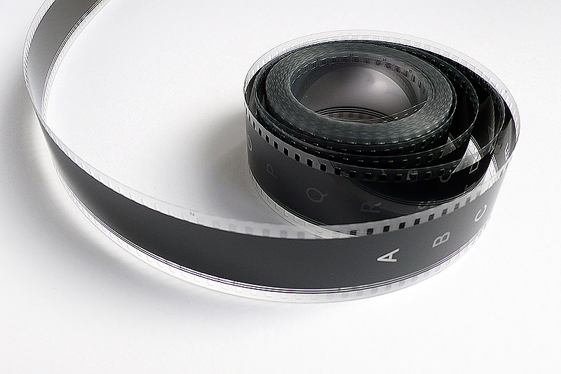
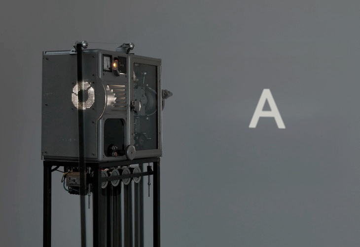
The cinematic work ‘Korpus Grotesk Film’ makes reference to this exposure technology, uses film as its transport medium and the light for the illustration, thus, in its very own way also stands as a homage to the cinematographic reproduction technology.
The film, highly compressed to 1 second — each frame one letter — running through the alphabet faster than the eye can see and the spoken alphabet lose their contours. It is a homage to machine-aided poetry in all its forms that embraces both the mechanical and imaginary aspects of what it means to tell a story.