Tool creation and use, the print revolution, the industrial revolution and the digital age are all cultural evolutionary steps towards the refinement of this drive to replicate objects of greater complexity with greater facility in less time. And yet, that they are steps also means that they describes change. Whereas most digital reconstructions of physical letters aim to smooth out or eliminate faults. In the process of transmitting letter designs from one medium to another, from metal to ink to paper is the process of cutting, casting, setting and proofing characters. They could become distorted, often as a result of uneven pressure. But modifications of the shape of individual characters hardly interfere with legibility. The recognition of terms is of utmost importance in the reading process, with a constant matching of typeface and content meaning. The typeface Korpus exploits the connection between the forms that letters take and the processes of their reproduction. The catalogue of small disasters from which it is built has been resolved in a typeface where what might have looked incorrect, ugly and fake is instead a soft, tactile and harmonious alphabet.
Korpus Typeface Development
Collection and investigation of the first general typeface reproduction forms and techniques.
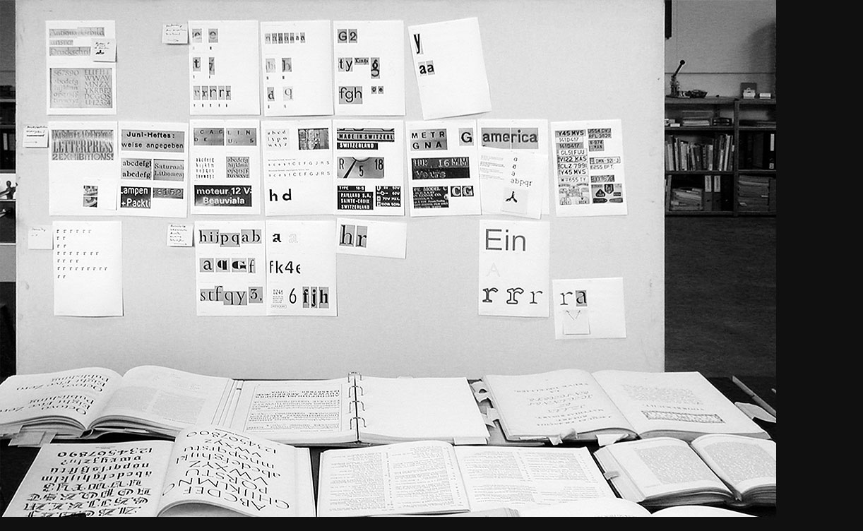
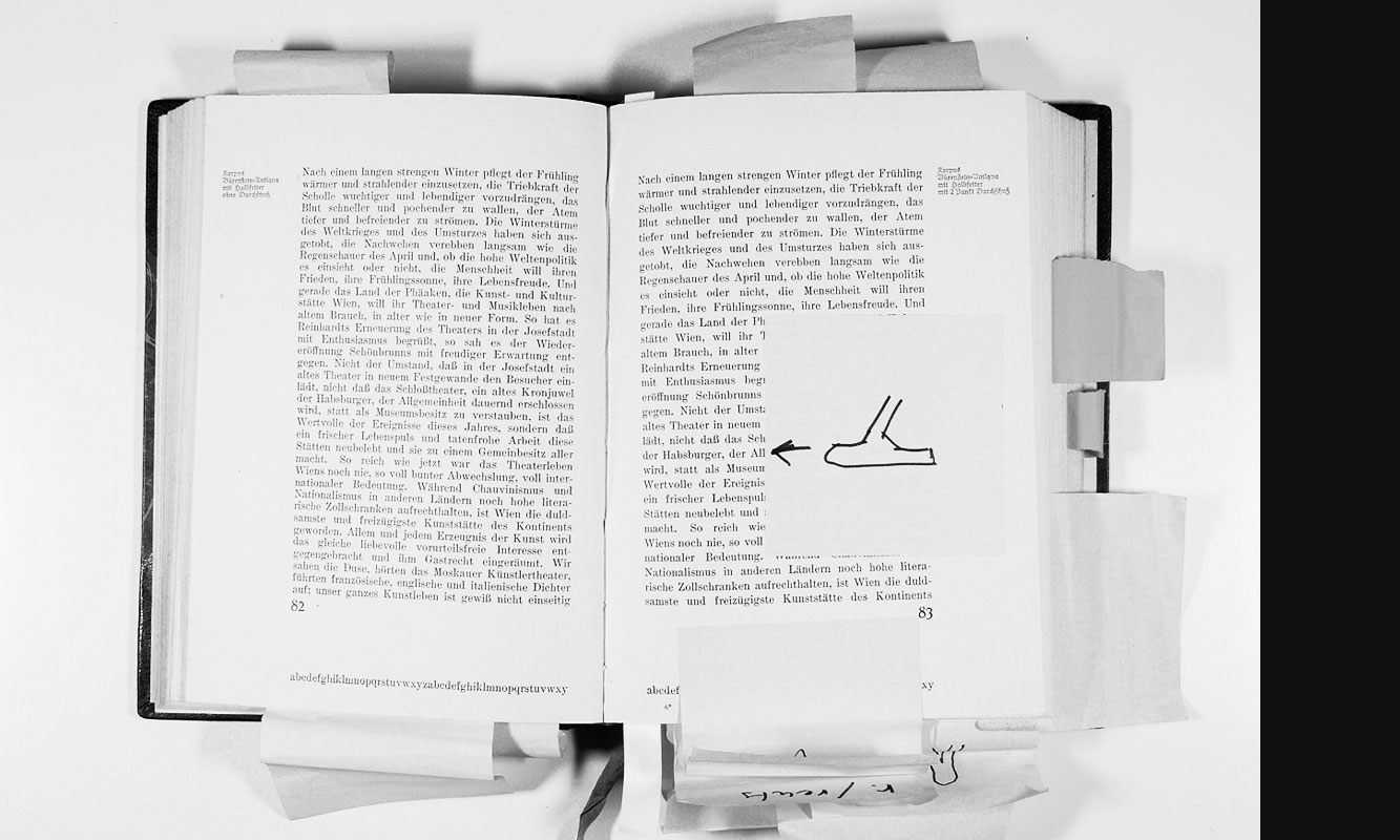
It was the type specimen book published in 1920 by the Großdruckerei and the Waldheim-Eberle publishing house in Vienna with various specimen pages for typesetting, which we initially analysed in general and later focused on for letterpress printing. We have collected the imperfections, the things that deviate from the presumed original, in order to recognise possible similarities in the outward appearance of these traces. However, the resulting serif typeface Korpus has nothing to do with nostalgia; it does not want to imitate something from the past, it does not want to be a retro typeface. Rather, it is the result of a search for new forms, for a translation into the present with contemporary technologies, and thus part of a versatile and practicable typography.
Studies on Shape and Interpretation
Type specimen book of the Großdruckerei and Verlag Waldheim-Eberle AG in Vienna from 1920.
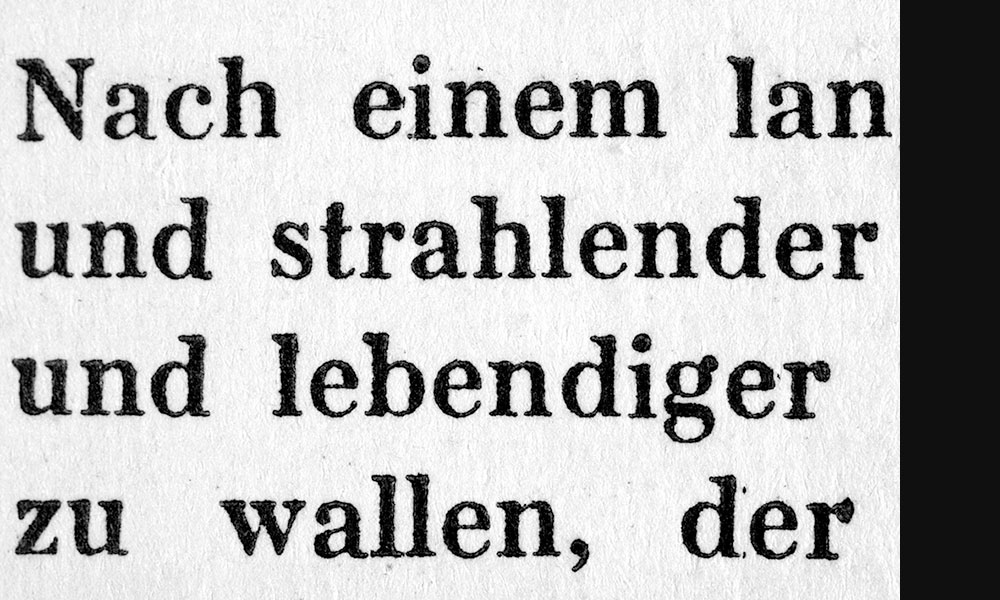
The starting-point for the ‘Korpus’ font investigation are text enlargements on 10 point letterpress printing. Each character is distorted individually as a result of uneven pressure on every single letter and irregular paper structure.
Characteristics
Dot and black gain for letters are typical characteristics of book printing. The characters seem to be unusually alienated when enlarged.
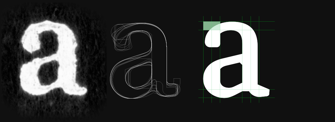
Searching for shaping and interpreting the character segments such as ball, link, curve and terminal. The unusually little contrast between vertical and horizontal extent gives the typeface a dense grey scale.

1 )
One striking feature of ‘Korpus’ is the imbalance between upstrokes and serifs. The distortion relates to the fact that the type does not lie precisely parallel with the printed sheet on the printed area.
2 )
Serifs and stroke brackets to the stem are emphasized by areas tapering diagonally.
3 )
The angled link in the characters Q R a b d e h p q simulates tapering in print. This is used in the same way in the pointed characters such as A M N V Z v y z 3 4 7 .
4 )
Asymmetrically constructed serifs for A V W k v x y .
5 )
The horizontally flattened links for the upstrokes and downstrokes for a d m n r u are highly individual interpretations in ‘Korpus’
6 )
The internal form of the balls for a c r is flattened off and part of the above-mentioned print alienation.
7 )
In contrast with the emphasis on the serifs, the ball form has been omitted in the characters with a hook that rises above the upper case height or goes down under the base line. The characters remain open and emphasize the horizontal. The inner hook with a kink in the characters J Q a f j ? ß and £ emphasizes a form breaking away through insufficient printing pressure in reproduction.
8 )
Instead of a ball form, the ordinary y stands on a serif. This supports a horizontal emphasis in the descenders.
9 )
The N serif is directly connected with the diagonal
10 )
Unusually for a serif font, the ascenders of the lower case letters scarcely rise above the upper case height. This is a more usual characteristic of classical sans serif typefaces.
11 )
The characters C E M F G S T Z are opened by the protruding end serifs.
12 )
The lower straight from the stem to the leg of the ordinary k establishes a formal relationship with the flattened links for n or u . But this essentially describes a break-away situation.
Korpus
Design by Michael Mischler and Nik Thoenen, 2009/11
Korpus is presented in the impressively book The Visual History of Type. It takes a close look at every major typeface produced since the advent of printing from the 1450s until now. The weighty tome offers a comprehensive survey of the major typefaces we know, with an emphasis on direct representation of 320 key historical type designs presented in their original specimens.
edited by Paul McNeil (MuirMcNeil)
published by Laurence King