Explore

T-Star Typeface Development

Font Development / 2005-02-12

The starting point was a monospace version of the typeface, developed for the book index of ‘Los Logos’ in 2005. Later on, a proportional typeface was advanced based on this monospace version. The narrow drawn letter forms are still recognizable and characteristic for T-Star. The consideration of the aspect of typography as two-dimensional architecture was very important as approach in the developing process of T-Star. The spaces where organised and structured in a simple graphical way following an ideological concept. It was the aim to arrange the typographical elements clearly to get well recognisable and characterful letter-forms. 


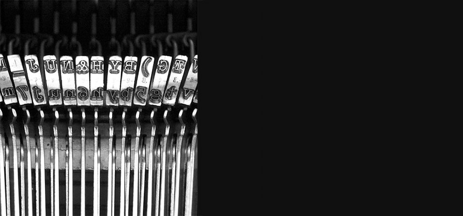
T-Star’s features include low-contrast, uniform line width, laterally flattened, round basic form, as well as cut-back ascenders and descenders. According to a construction kit the elements straights, diagonals and curve-segments, were combined and arranged on a basic grid. Where predetermined sy stems proved unsatisfyingly, shapes were interpreted intuitively, but stringently. The result is a plain, technical style typeface that is slender in its proportions and highly economical when it comes to the space taken up by body text. It’s appearance is marked by openness and individual characters show surprisingly unconventional features. 

From Monospaced to Proportional

Low-contrast, uniform line width

Monospaced typefaces result from the limitations of mechanical typewriters. When the typist pressed a key, the carriage moved the paper the same distance each time, so it was easier to return to a previous printing point to make corrections and do tabulation work. The terms “typ ewriter” and “monosp ace” have a common genesis but are not interchangeable. We can find typefaces created for the machine with different character widths, and some mono-spaced typefaces designed today have no aesthetic or historical link to typewriters.

Even before electric machines appeared, manufacturers had already made a few trials for the use of proportional typefaces in mechanical models. But only electric models allowed a visible presence in type-writers using typefaces with several char-acter widths. The new printing devices — the golf ball and, later on, the daisy wheel in electronic machines — introduced the possibility of using proportional typefaces in an accurate way. 


Evolution


In 2016 T-Star was completely rebuilt to improve the legibility in body text and to get a smoother typeface for the screen presentation for the web appearance as well as for all Microsoft Office applications. Therefore all curves and shapes of all glyphs have been precisely designed and redrawn to get a more harmonious and catchy alphabet. Another intention for the redesign was to build the font family in a more systematic way but with an additional focus on the typographic exceptions to get a smoother and more refined appearance. The goal behind this was still to keep the simple looking typeface with its geometric appearance which makes T-Star outstanding on the font market.


Uniform vertical metrics. Capital letters and x-High has no typographical increase.
All weights includes the same metrical units for a striking appereance

Serpentine road is precisely studied, designed and constructed. Installed in unspoiled nature like mountain areas it seems highly contrastive. With its strange linearity and construction the road is an enormous visual incision in the alpine world, and it cuts mountain slopes into parts. The road itself is divided into straight and curved segments and looks like carved in the slope. It is not possible to determine whether it is the mountain that claims the definition of the serpentine or whether it is the kind of construction created by man. The transition from the straight into the serpentines is difficult to set: The inside of the curve mustn’t be too steep, as other-wise the road cannot be driven on, but steep enough to get the necessary amount of gradients. Most of the huge mountain passes were important connections to other regions and other cultures and were built in the early 19th century. They were important for exchange of any kind and stand for discovering and exploring as well as for a technical development. 

Hans Gugelot, Furniture system M 125. A starting point for industrial production is the standardisation of the components and, of course, the rejection of unnecessary accessories. It is fundamental that, in the case of standardisation and prefabrication, the development process starts from the very smallest element in order to obtain the next bigger unit or even larger one. The furniture sy stem can be carried forward by creating spaces with the wall elements, provided that the statics correspond to the basic system. In architecture and in urban planning, we find the same basic principle, in which not uniformity, but harmony and at the same time greatest adaptation to individual requirements is the result.


Impact


Over the years we discovered that the users appreciate the fact that T-Star can be used for logo design or headlines (as they use to say, without doing anything it looks great!) and at the same time for the use of body text. On one hand, with its geometrical appearance the typeface has a strong impact on the bigger point sizes, and otherwise the calm and straight design works very well for body text. Especially the narrow letters are interesting for tightly held columns, and the non-typographical fact of keeping the same metrical units over the weights makes the typographical results always look striking.


Comlete T-Star Family and T-Star TW

Bespoken Typefaces  T-Star  and  T-Star TW