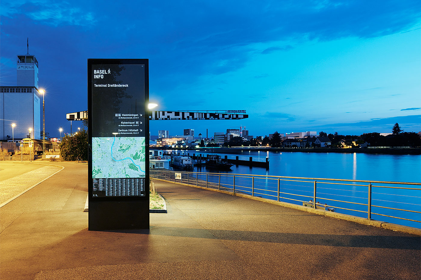
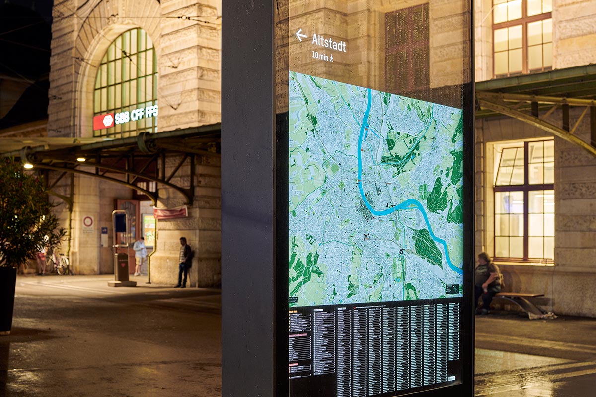
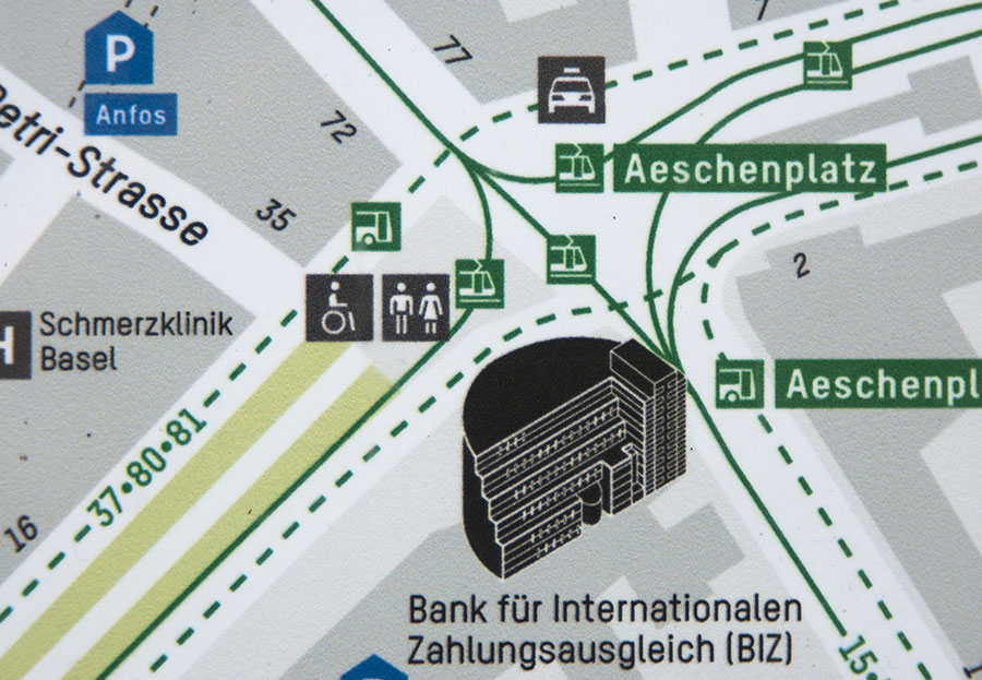
For the new pedestrian orientation of the city of Basel, Binnenland was commissioned to revise its own typeface T-Star. In addition to optimising the typeface for the signposting and plan lettering, a matching series of pictograms was to be developed. For both the typeface and the pictographic signs, the design requirement was legible reproducibility in colour and in very small sizes.
Explore ✕
Basel City Pedestrian Orientation
Client: Präsidialdepartement des Kantons
Basel-Stadt, Kantons- und Stadtentwicklung
Typeface Adaption: T-Star by Binnenland
Development of Pictograms:
Collaboration of Binnenland & Thomas Hirter
together with Lengsfeld, designkonzepte GmbH
Signage Design and Maps:
Lengsfeld, designkonzepte GmbH
Photograph: Roman Weyeneth

Typeface Family Overview


Pictogram Overview


Development
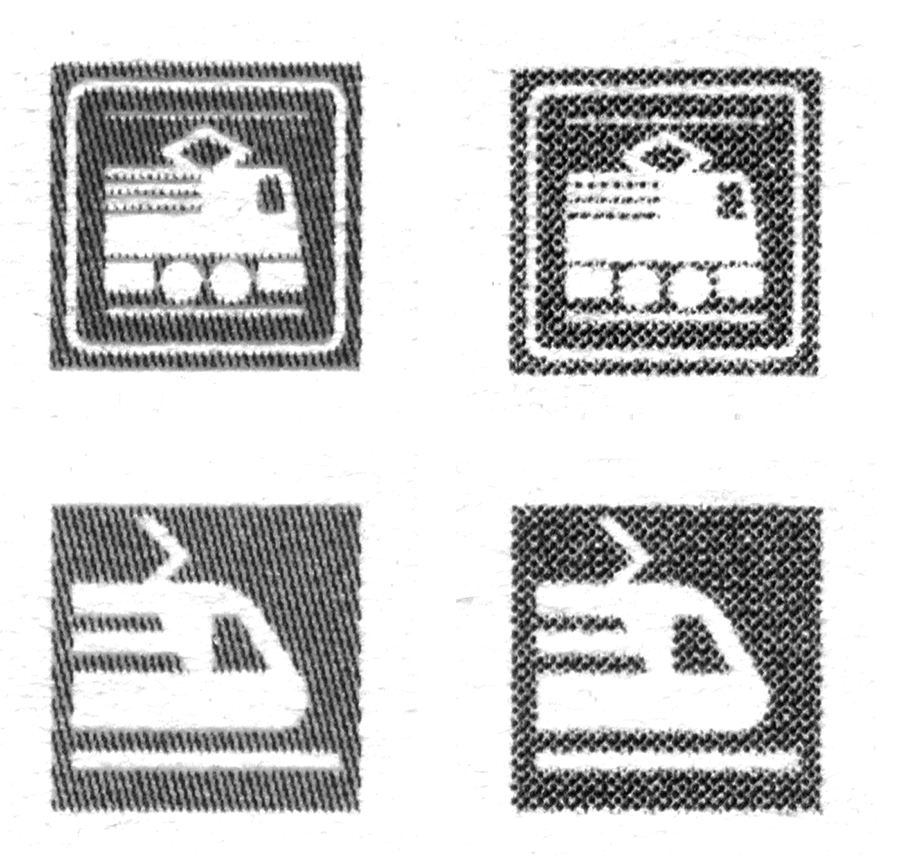
When reproducing type, printers and designers repeatedly struggle with unwanted visual phenomena of alienation. These are triggered by the printing processes used or the print substrate. In small applications and through the slight displacement of several printing inks, these are additionally intensified. Since the site plans were reproduced with different printing processes and the templates were temporarily produced internally by the Basler Verkehrsbetriebe, a commercially available laser printer served as a reproduction reference for the development of the pictograms. These requirements had a decisive impact on the design process: in order to ensure legibility, the interior spaces and openings of the typeface had to be enlarged. An extremely reduced formal language had to be developed for the pictorial contents, which meant a constant balancing between abstraction and recognisability of the signs.
Surveys and visual tests with outsiders provided insights that were incorporated into the pictogram design, as were the parallel investigations into their contemporary form of presentation. Especially in public transport, motifs are often used that show technical systems that are long outdated: Railways, buses or trams look different today than they did fifty years ago. For example, the depiction of wheels has been dispensed with. What was once a typical feature of the means of transport no longer has the same visual relevance in today's design of low-floor trams and clad trains as well as raised platforms. The result is a series of pictograms that provide information in a very reduced visual form in a seemingly familiar language that can be quickly understood.
Testprint investigation
Laser printer tests to check the loss of information. The prints were made in the original size of 5 × 5 mm.
Conventionally designed pictograms with different line widths and common motif details. Much of the reproduction is rendered imprecisely by the dot screening. An impossibility for illustrations in very small sizes.
A reduced formal language makes it possible to use them in very small sizes. The grid is less noticeable with more generous shapes and thicker lines. The shapes remain intact even if the grid points are shifted.
Relation between typeface and icon

Font revision with regard to optimal reproduction and design adaptation to the pictogram language. In addition to the simple formal language of the typeface and pictograms, the circle is the unifying element. In the typeface, this was taken up via the round punctuation.
Typeface modifications

Compared to the T-Star as a starting point, generally more contrast in the horizontal and vertical extension of the ductus. Simplification of the character Q and widening of M and N. More open and wider forms for a more balanced typeface in small sizes, using e and m as examples.