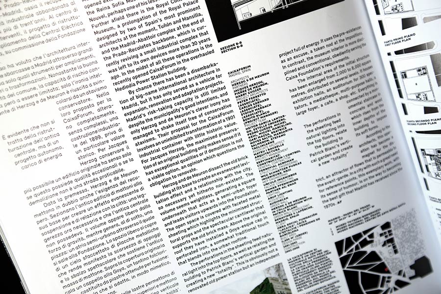
Domus is an Italian architectural magazine founded in 1928 by Milanese architect Gio Ponti. The first issue of the monthly magazine Domus appeared on 15 January 1928. It was the first publication ever to aim to combine architecture, interior design and Italian decorative arts.
In 2008, the design studio Onlab (Nicolas Bourquin and Thibaud Tissot) was commissioned to redesign the magazine. What was required was a new, visually concise identity that dealt critically and ambitiously with the magazine's themes as well as its layout. At the same time, readers were to be respected in terms of comprehensibility and readability, yet surprised. In Italian there is the term ‘vigoroso’, which means "powerful, energetic" and served as an imaginary leitmotif for all discussions about layout and typography.
Binnenland was called in for typographic advice—in a first step to find new typeface positions not yet occupied and in a further step to individualise the selected typefaces for Domus and optimise them for the design of the magazine.
Domus — Redefine Typography
Client: Editoriale Domus, Milan, Italy
Editorial Redesign: Onlab
Typeface Redesign: Binnenland, Michael Mischler in collaboration with Onlab
Gill – Redesign
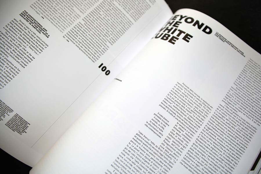
In the typographic discussion about the term ‘vigoroso’, Eric Gill’s typeface Gill, designed between 1928 and 1930, stood out during the research. The typeface has a powerful and individual design language, especially in the bold weights, and certainly shows its qualities for the intended typographic use. However, due to its typical features of the time, the typeface appeared rather conservative in its design. With the idea of simplifying the typeface in a design adaption and balancing out the strong stroke contrast, the desired typographic image was achieved. The newly created versal typeface stood for the majority of the title typeface with its striking effect. In the following issues of the monthly magazine, it was often used in very small point sizes for subtitles or legends or to emphasise text information.
The diacritical marks have been redrawn in terms of horizontal emphasis. This supports the lines in the application of the typeface in small point sizes and increases the independence and conciseness in the use of the title.
The final forms, which were humanistic in the original typeface, were redrawn. This allowed for a more homogeneous extension of the characters and a more uniform line management in the contrast of the individual characters to each other.
More balanced proportions in the characters, as here in the example of the letter "R": The upper and lower parts of the character are balanced. The geometric curves give the typeface the necessary modernity.
Relevant
The second typeface used in the magazine was the typeface Relevant, which had been introduced in a beta version by Binnenland shortly before. Its terminals as well as the homogeneous round and recurring curved forms offered a soft and easily readable typeface. The narrow running Grotesk typeface is very space-efficient when dealing with large amounts of text.
The single-story ‘a’ also emphasised the look of the Italian language with its many round shapes. In contrast, the two-story ‘a’ was used for the English language.
Application
Gill Dorso
Relevant Normal
Relevant Typeface in the Section TypeTester


