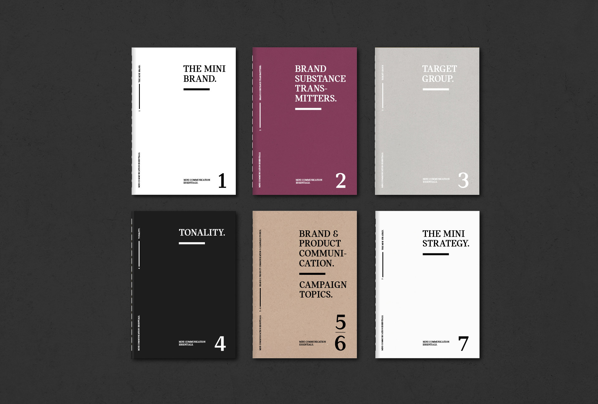
The revision of the MINI logo by the Berlin agency KKLD, away from spatial 3-D effects to a reduced graphic design language, and the repositioning of the brand called for a new corporate design typeface. The starting point was the typeface Catalog, which was not obviously visually related to the revised logo.
Corporate Typeface for MINI BMW
Design Strategie
In order to make the discussion about the possibilities of font changes comprehensible for the client (MINI, BMW), the variety of the design element forms was divided into round and square in order to generate prototypical fonts. The division into these two groups of forms refers to the form-effect analysis described by Karl Gerstner in his publication ‘Compendium for Alphabets’. In two abstract pictorial signs (one with organic round shapes and a second one with corners and edges), he divides and visualises the abstract terms ‘Maluma" and ‘Takete’. The majority of adult people in our language area unhesitatingly refer to the round figure as ‘Maluma’ and the square one as ‘Takete’. Although we have never learned what "Maluma" looks like, our intuitive association creates a link between sound shape and a visual equivalent. These are often based on natural similarities.
The examples show that the ‘not significant’ expression is heterostereotypically shaped by language. The same is true in the field of writing: ‘Expression’ is a psychological factor that is always part of a draft or layout. We can draw the criteria for visual expression from spoken language, since it is more developed here. Both can transmit textual information and colour them differently, but with spoken language action is instantaneous and immediate. The audience can be involved and carried along not only acoustically but also visually. The expression (the how) can influence what is said (the what) and vice versa. A ‘false’ voice can be an effective impact, but it can also be irritating and absurd. In a figurative (or limited) sense, this also applies to typography. Just as timbre is one of the instruments of expression of spoken language, in typography the appropriate allocation of the typographic setting with the appropriate typeface to the given information. With regard to the design of type, the same principles apply, with the difference that the catalogue of forms of the timbre is always in relation to the skeletal structure of the letters and this in a dependency on legibility.
Process
fig. 1
The division of the world of forms into round and square – this basic principle was transferred to the typeface Catalog in different variations. The circle, which has neither a clear beginning nor an end, is often associated with infinity and security. Its round and smooth shape is considered feminine and soft. The circle symbolises the earth and the sun. The square, in contrast to the circle, is associated with masculinity. It represents stability, security and, through its angular appearance, absolute geometry. In design, the square is a basic module and has a structuring effect.
fig. 2
The typeface Catalog was the starting point for these visualisations of the different forms of impact/effect. Round and square: How do the two clearly semantically located basic forms affect the font in the transfer?
fig. 3
Follow-up study on rhythm and expansion. The expansion of the signs as analogy and visual correspondence in the accentuation/emphasis. Once with a broadly drawn ‘O’ to emphasise ‘Cooper’ and once with metrically constant rhythmic extension of the characters.
Decisions
fig. 4
Strong horizontal emphasis
Metric uniformly rhythm
No round corners in the serfis and horizontal cutted terminals
Typeface Overview
Client: BMW Group, MINI Brand Management, MINI
Corporate Re-design: KKLD Berlin
Typeface Design: Binnenland, 2015
Corporate Typeface: MINI Serif
Related Typeface Catalog


