Initial Moment
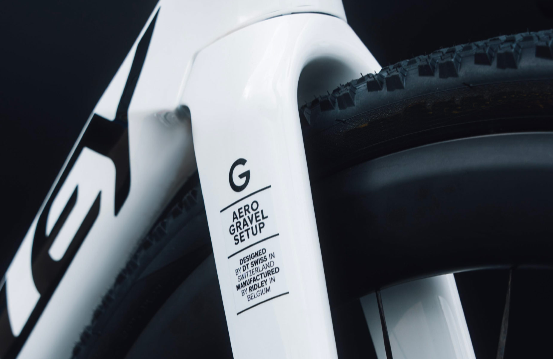
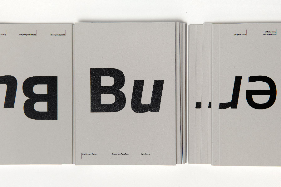
It takes a while to reach the top of the pass. The road wound endlessly through the needs and design possibilities up to the destination we were aiming for. In 2019, Binnenland came into contact with DT Swiss by chance. Connections in the design world also emerged through shared passions. We were called in as experts during the development of the new corporate design strategy. This opened up opportunities for a much deeper exchange with the client about typeface, its application and the resulting importance in the perception of the company and its products.
A feedback survey was conducted with the people involved in the reorganisation. The evaluation – how the company is perceived, or should be perceived – served as our conceptual basis. “Straight, technical and harmonious, geometric and modern” were among the terms noted. The core statement was: Form follows function! For us, this statement in relation to font development also meant that unconventional forms must always be subject to legibility. In addition, the DIN typeface used up to that point served as a reference. This was analysed in terms of its aesthetics and function for advantages and disadvantages in order to create a positioning for the new typeface.
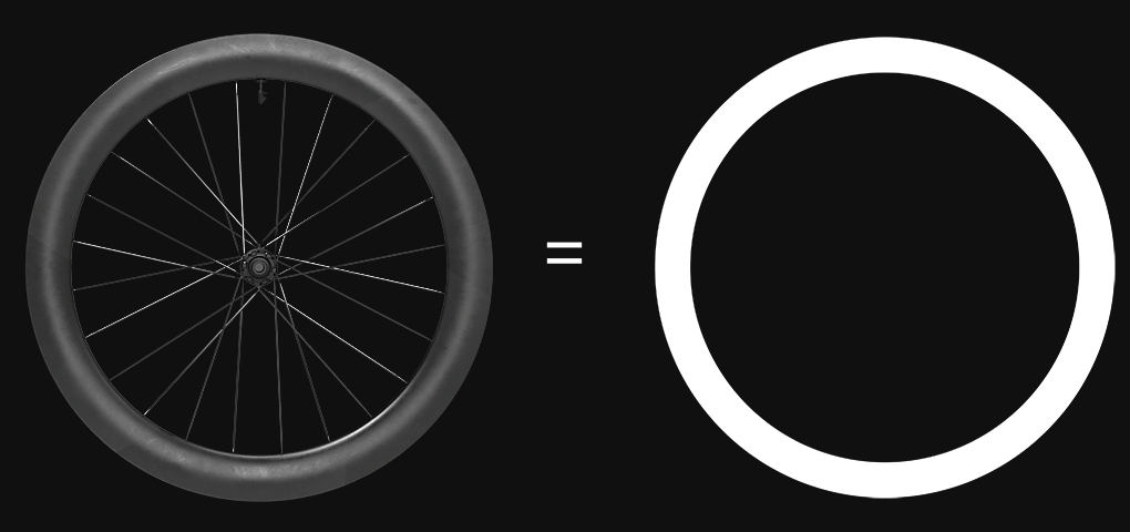
o = o
DT Swiss produces high-quality components for bicycles. The defining element of a bicycle and the central product of DT Swiss is the wheel. A round basic shape for circular characters seemed predestined and ideally complemented the defined parameters from the jointly developed conceptual basis for the desired typeface appearance.
